NGED's Incumbent Forecast
How NGED forecasts primary-substation demand today, before this project. It uses no weather
model and no machine learning: for each substation it assembles a small ensemble of historical
analogues from that substation's own past, plots them, and lets a human operator read a forecast
off the spread. This is the incumbent — the method our models will be compared against — so we
reproduce it faithfully as the nged_incumbent baseline
forecaster.
The recipe (confirmed by NGED, July 2026)
For a given substation and target half-hour, the analogue ensemble is the observed power at the same time-of-day on the same weekday from:
- the last 6 weeks (6 analogues), and
- the seven weeks spanning 49–55 weeks back — roughly a year ago, bracketing the same calendar point (7 analogues).
That is 13 analogues in total.
There is no weighting, no holiday alignment, no anomaly rejection, and no load-growth scaling.
The output is the plot itself — an operator looks at the 13 traces and their spread and forms a judgement. If a single deterministic number is needed, NGED probably pick the 95th percentile of all the values. That 95th percentile is a deliberately conservative operating point: the tool's job is to warn when demand might approach the network's flex/firm capacity limit, so erring high is the safe direction.
The operator's view
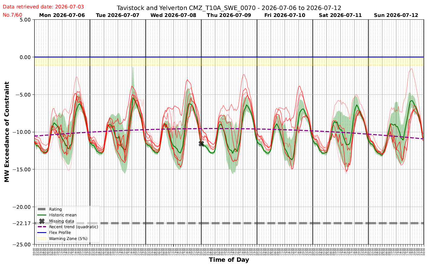
The screenshot above is NGED's operator tool for one feeder (Tavistock & Yelverton,
CMZ_T10A_SWE_0070) over a week. Demand is plotted as headroom against the constraint — the
y-axis is "MW Exceedance of Constraint", where the blue Flex Profile line at 0 is the limit
and more-negative values are further below it. Reading the overlays:
- Red/pink traces — the individual historical analogues (the 13 above).
- Green line ("Historic mean") and the green band — the mean of the analogues and the spread around it.
- Purple dashed ("Recent trend (quadratic)") — a smooth recent-trend line the tool overlays as a sense-check.
- Yellow "Warning Zone (5%)" just below the Flex Profile, and the grey Rating line (firm capacity, here ≈ −22 MW) — operational thresholds, not part of the forecast.
The strong twice-daily peaks and the weekday/weekend difference are exactly the structure the same-weekday analogue selection is built to capture.
Why it matters for us
Because the incumbent approach uses no weather and no ML, beating it is the project's core deliverable — and because it does "no further processing at all", several cheap upgrades (e.g. aligning bank holidays and moveable feasts) are genuinely useful work rather than reimplementations. Both the faithful replica and the "cheap upgrades" variant are specified in Metrics & leaderboard → Baseline forecasters.